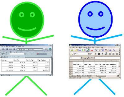
 As promised in an earlier tip, I wanted to write a post dedicated to creating tables in your blog. You would be surprised at how much I use this valuable tool to get things to look just right and maximize my space on sidebars, footers and even in posts. What you can accomplish with the use of tables is amazing and I think it is a tool that every blogger should be familiar with...so here we go! (As a matter of fact, I used tables extensively in this blog post so that I could get my code and results sections to line up side by side!)
Today, I want to explain to you how to build a table such as the one I have displayed in my footer region, entitled "My Blog is Listed Here". The function of this table is to display all of my mini-buttons in an attractive and SPACE SAVING way. I will start out showing you how to create a basic table and then perhaps in a future post, we can discuss how to jazz it up a bit. Decide where you'd like to put your table and then start with the following code:
<table> (This is the beginning of my table)
</table> (This is the end of my table)
This denotes that you are creating a table. Next, you must add a horizontal row to your table, which adds the following code:
<table>
<tr> </tr> (This is row 1)
</table>
Now I have a table with one row of information. Next, I want to add cells to my row...I will start with two cells here.
<table>
<tr> (This is the beginning of row 1)
<td></td> (This is cell 1)
<td></td> (This is cell 2)
</tr> (This is the end of row 1)
</table>
Now, as long as I have the table shown without a border, all of this that we have done will look "invisible" on our page. So that I can show you exactly what we are creating, I am going to add a very simple border to our table by inserting the following addition in the table portion of our code.
Code |
|
||
|
<table border="1"> <tr> <td></td> <td></td> </tr> </table> |
|
Let's also add a background color to our table so that we can see it better. There are many ways to do this, either by listing the color's name or by using its number. I refer to this website frequently so that I can get the exact colors I want: CSS color chart Next, you might also want to specify the dimensions of your table. You can do that by adding height and width tags. I will add a width one in the following example so that you can see how it looks:
Code |
|||
|
<table border="1" bgcolor="#8A2BE2" width="200"> <tr> <td></td> <td></td> </tr> </table> |
|
Now, let's begin to add some content to our table's cells. In cell 1, I'm going to add a small image of a rose and in cell 2, I'm going to add some text. Here's how it's done:
Code |
Result |
||
|
<table border="1" bgcolor="#8A2BE2" width="200"> <tr> <td><img src="http://www.floral- directory.com/flower.gif"/></td> <td>Picture of a rose from The Floral Directory</td> </tr> </table> |
|
Because I would like this picture much smaller, I'm going to set the dimensions of the height to something more manageable. I am also going to add another row to my table that also contains 2 cells containing text and an image.
Code |
Result |
||||
|
<table border="1" bgcolor="#8A2BE2" width="200"> <tr> <td><img src="http://www.floral-directory.com/flower.gif"/></td> <td>Picture of a rose from The Floral Directory</td> </tr> <tr> <td>Picture of a rose from The Floral Directory</td> <td><img src="http://www.mommylivingthelifeofriley.com/ wp-content/uploads/2010/04/flower.gif" alt="Floral Directory" height="100" /></td> </tr> </table> |
|
Finally, most people like their items to be centered inside of their cells. This is an easy thing to accomplish too. Depending on whether you'd like to horizontally align your items to the left, right or center, use the following align code. If you'd like your items to be vertically aligned as well, you can accomplish this using the valign code with the options top, middle or bottom. I normally input this code into the (row) region because then it will apply to the entire row, but you can also input this into the (table) region or even the (cell) region to specify exactly how your contents should be aligned. I will put this code into the (row) region in the first row and will input the code into the (cell) regions in the second row so that you can see the different options you have available.
Code |
Result |
||||
|
<table border="1" bgcolor="#8A2BE2" width="200"> <tr align="center" valign="middle"> <td><img src="http://www.floral-directory.com/flower.gif"/></td> <td>Picture of a rose from The Floral Directory</td> </tr> <tr> <td align="left" valign="top">Picture of a rose from The Floral Directory</td> <td align="right" valign="bottom"><img src="http://www.mommylivingthelifeofriley.com/ wp-content/uploads/2010/04/flower.gif" alt="Floral Directory" height="100" /></td> </tr> </table> |
|
There you have it! Your introduction to creating basic tables is now complete. Stay tuned for an upcoming addendum to this tutorial which will get into how to combine rows and columns as well as jazz up the borders, text sizes, etc. Hope you have fun applying these techniques to your own blog design! If you have any questions, please leave me a comment here and I will do my best to help! Happy Blogging!
I'm a former 7th grade Science teacher turned stay-at-home mom that lives in Houston, Texas. I am married to my college sweetheart and have a beautiful daughter named Riley, who definitely keeps me on my toes! I am also involved in starting a small business which would both manufacture and sell an invention that I've patented, called Toothpaste 2 Go. I love interacting with my readers and hope to learn as much about you as you learn about me!
Melissa @ Mommy Living the Life of Riley!
Add Melissa Cleaver to your LinkedIn Network
Add Mommy Living the Life of Riley to your Google+ circle |


